Continental has introduced the future of displays in four-wheelers namely Shytech displays. The display focuses on essential information and relaying it when needed instead of cluttering the screen with unnecessary information. Displays seem to be dominating the cockpit of four-wheelers as well as two-wheelers alike. Over the years, the length of displays along with functionality and intuitiveness has only increased.
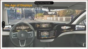
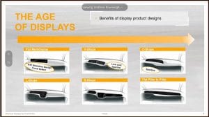
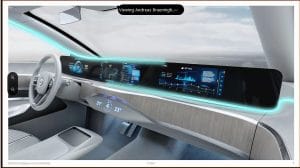
Back in 2005, there were two segregated small-sized displays for minimal entertainment and basic information like fuel level, engine temperature, speed and RPM. Now, there is a pillar-to-pillar display concept where the dashboard is mounting a huge screen across its length that bombards information.
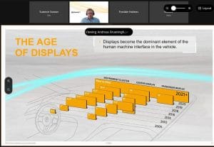
There are multiple styles of displays that can be seen in cars, each designed by the needs and requirements of the customer, catering to particular preferences. Some displays focus on just the driver while others indulge the passenger as well for entertainment and providing access to control the surroundings.
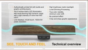
User experience is the main focus and large screens are one of the main contributor. The layout of the screen can be categorised into three different designs, one is where the display focuses on the driver and minimal to the passenger. The other design is where the information is different for ICE engines and electric powertrains, and the last is where sporty nature is preferred over comfort relaying of information and experience. Customisation of information is available for the users to handpick the information that seems worthy to be monitored. The size of the screen varies from 25 to 50 inches power by matrix backlight, OLED along with camera integration, haptic feedback and gesture control.
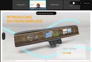
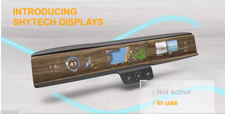
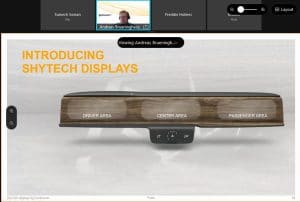
Along with the increase in the length of the screen, there has been a parallel increase in the number of functions a screen can now control along with cross-domain working, connected tech and digitisation. It also leads to driver distraction because of unwanted information and cluttered screen. Continental introduces ShyTech display that converts the dashboard into a screen instead of mounting a screen on the dashboard which can look like a sore thumb sticking out.
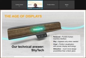
It has a little more aesthetic feel to it, as no screen is protruding out of the dash and information is only relayed when it is needed. This keeps the clutter to a minimum and reduces driver distractions.
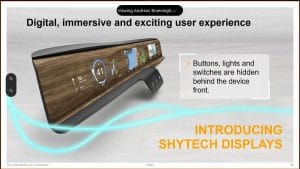
The buttons, lights and switches are hidden behind the surface which makes it a seamless screen to interact with. The dash will be divided equally between the driver and the passenger.
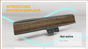
The display has a no-glare feature along with multiple background options to choose from. When the screen is off, it looks like a basic dash with no mounted screens and when it is on. All the information is displayed right on the dash without compromising visibility.
It comes enabled with touch, gesture and voice control. The ShyTech display provides a glimpse of what the future has in store for automobile digitisation and how the user experience will be in the future of mobility.







Leave a Reply