

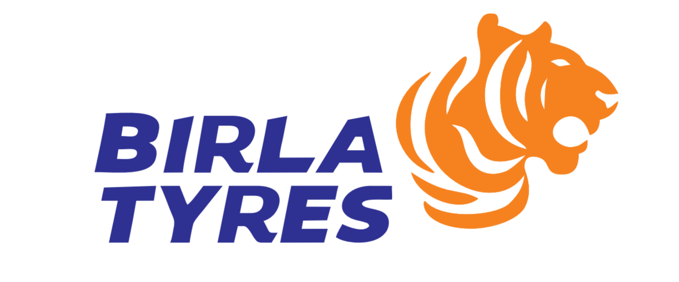
Birla Tyre has unveiled a fresh brand identity featuring a dynamic new logo and a revamped corporate website, marking a pivotal step in the company’s transformation journey under its new promoters a consortium led by Himadri Speciality Chemical and Dalmia Refractories.
The rebranding initiative reflects Birla Tyre’s renewed strategic direction and ambition to evolve as a future-ready player in the mobility sector. Central to this transformation is the new logo, which features a custom-designed wordmark that conveys speed and forward momentum. It is paired with a powerful tiger symbol named ‘Tyger’ embodying strength, agility, and leadership. The bold Blue and Orange colour palette further enhances the brand’s visual impact, reflecting trust, optimism, and its revitalised spirit.
“This rebranding is more than merely a visual transformation; it is a reaffirmation of our dedication to purposeful development and progress,” said a company spokesperson. “Our new logo encapsulates the essence of Birla Tyre, which is founded on three fundamental pillars: a legacy that motivates boldness, a product line that is prepared for the future, and an unwavering commitment to continuous innovation.”
The brand revamp comes at a time when Birla Tyre is actively working to reposition itself in both domestic and global markets. The company is preparing to launch integrated marketing campaigns across digital platforms, television, print, and outdoor media, aiming to engage both new-age consumers and long-standing customers.
With strategic clarity, operational restructuring, and renewed capital support, Birla Tyre is now focused on expanding its product portfolio, re-entering key markets, and building a robust distribution network aligned with emerging mobility trends and consumer needs.
This comprehensive rebranding effort signals a clear intent: to reclaim leadership in a fast-evolving automotive landscape through innovation, resilience, and customer-centricity.


Leave a Reply